Visualizing MBTA commuter rail performance
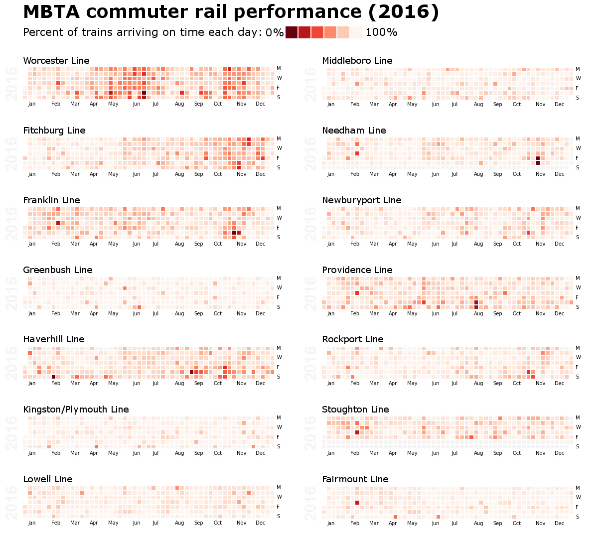
The graphic below shows the daily on-time performance of each MBTA commuter rail line in 2016. The heatmaps were produced in python using data published by the MBTA. The graphic was created with GIMP 2.8.

The graphic below shows the daily on-time performance of each MBTA commuter rail line in 2016. The heatmaps were produced in python using data published by the MBTA. The graphic was created with GIMP 2.8.
